
11 November 2015 | 3 mins

From a young age, John White enjoyed painting, drawing and making things. Yet it wasn’t until he attended art school at the University of Tasmania that he started to think seriously about a career in graphic design. After working in advertising and design studios for almost two decades, John joined Australia Post Philatelic on contract in 2007, before becoming a permanent member of the design team in 2010. We spoke to John about the ins and outs of philatelic design.
What led you into graphic design?
Initially, I started off with intentions of being an art teacher and practising artist. I studied graphic design as part of my Fine Arts Degree, and thanks to the influence and encouragement of some amazing teachers and artists I became really interested in graphic design and printmaking.
Was it difficult to adapt to the specific requirements of philatelic design, when you joined the Philatelic design studio?
To me, design is about spacial awareness and applying an appropriate style or feel to the project at hand. I translate concepts into visual forms, whether they be large or small in format. Having said that, there are of course a lot of things that you need to consider when working in such a small scale.
The biggest challenge I found when joining Philatelic was getting used to the abbreviated terms and philatelic jargon. When I first started I had no idea what a FDC (First Day Cover) was, for example!
When you receive a stamp brief, how do you approach starting the design process?
The first thing I do when I receive a brief is to interpret what is required and how best to achieve that outcome. I always research the topic and look at what has been done previously, so I can try and bring something different to the design. In the case of historic topics, I try to respect the age or feel of the original era and come up with an appropriate approach.
What do you use for inspiration in your design work?
As a designer I find inspiration can come from anywhere. Art, photography, architecture, travel … sometimes inspiration comes from the strangest places. I’m always fascinated with the relationship between type and image. I find old posters, packaging, magazines and logos with really strong type inspiring. I love to travel and always make sure I visit as many galleries as I can when overseas. My most recent visit to the International Design Museum in Munich was amazing.
What are the most enjoyable aspects of designing stamps?
I enjoy the research that goes into designing stamps; you learn so much. Stamps represent historical events, people and places that are fascinating and that possess an ability to reveal our history and cultural identity. I learn something new with every project.
What are the most challenging aspects?
Each stamp issue comes with its own challenges. Coming up with the right solution for each issue is just part of the design process. Some specific challenges can include finding appropriate imagery: you might find the perfect illustration or photo, but can’t get permission to use it or there may not be any reference material at all.
What other projects do you design as part of the Philatelic Design Studio?
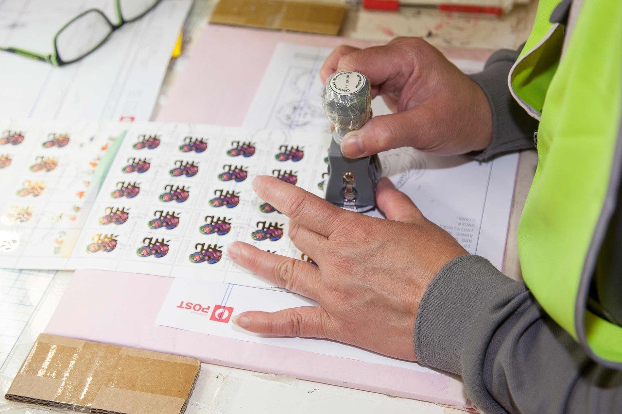
As part of the design studio the projects we work on vary on a day-to-day basis. As well as designing the stamps themselves, we design the associated products such as stamp packs, first day covers, minisheets, medallion covers, maxicards and postmarks. We also design the Annual Collection, Territories Collection, and other philatelic publications such as the Stamp Bulletin and Impressions catalogue. Among other things we also produce limited edition and licensed products, as well as producing point of sale items, posters and displays.
What has been your favourite project to work on so far and why?
That’s a difficult question, but I would have to say that I really enjoyed producing the Annual Collection of Australian Stamp 2015 and the Australian Territories Collection of Stamps 2016. As a designer I particularly enjoy typography and the page layout process. I also enjoy designing prestige stamp booklets and packaging for limited edition products such as stamp and coin sets.
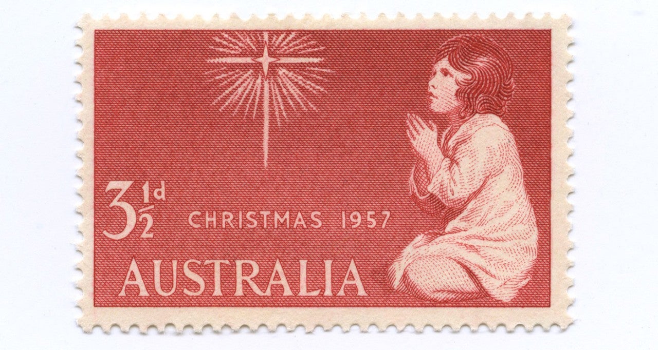
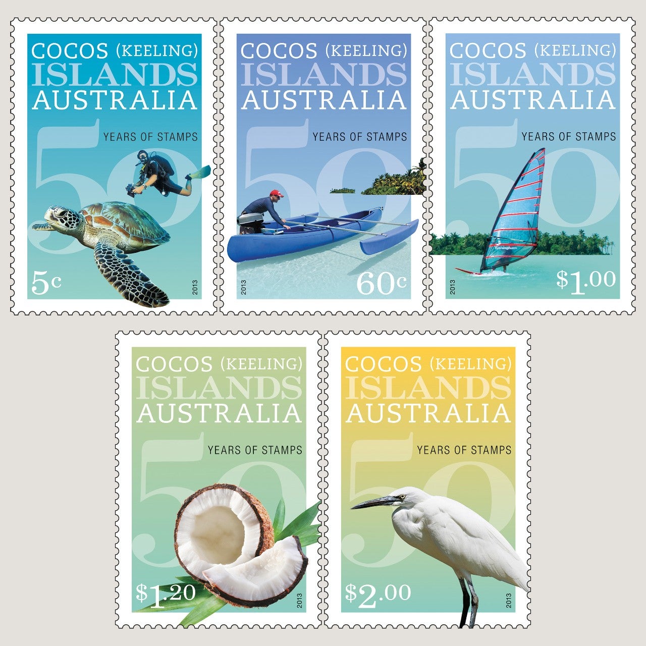
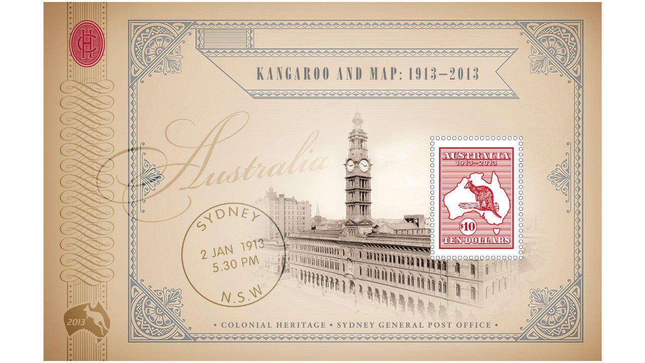
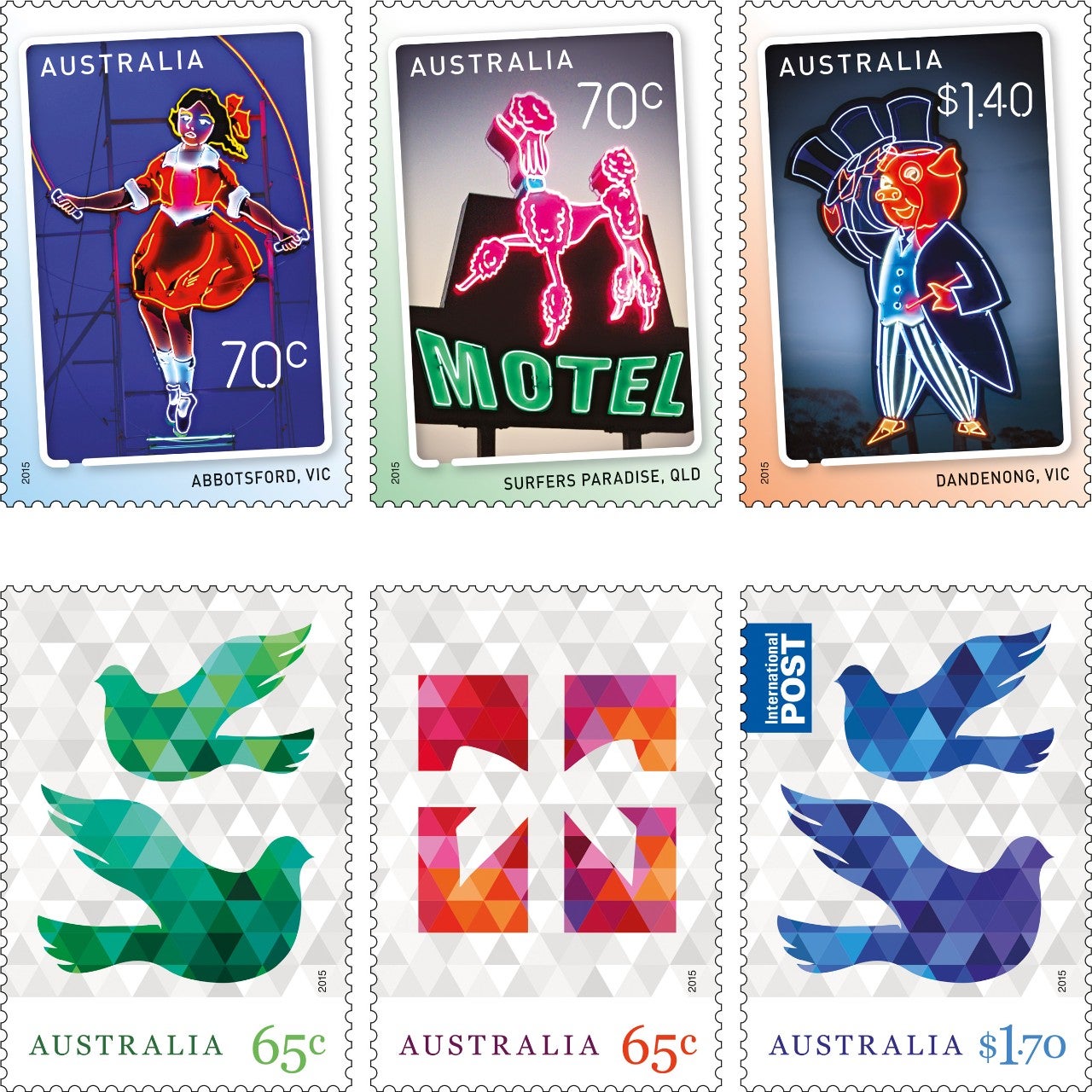
Stamps that I have particularly enjoyed working on include: Cocos (Keeling) Islands 50th anniversary of stamps in 2013, the Kangaroo and Map 1913-2013 issue, Signs of the Times in 2015 and the secular Christmas stamps, also in 2015.
What sort of software do you use for philatelic design?
We mainly use Adobe Illustrator and Photoshop when designing stamps, and we also use InDesign to design the associated products. These programs are industry standard.
What size do you work at when designing and how to prepare the finished art?
When designing, we normally work at two different scales, 400% and actual size. In some cases the original illustrations and photographs are much larger in size. This needs to be considered, because when they are reduced a lot of fine detail can be lost. When reducing the artwork, we also need to ensure that fine serif fonts and reversed type is readable when reproduced.
After a design has been approved and finalised, we prepare the finished art files for the printer, which typically includes packaging the final files, together with the fonts and image files used in the design, and often incudes layered Photoshop files. This allows the printers to go into a particular aspect of the file to adjust it, if necessary. If the file was compressed or ‘flattened’, they would not be able to do this.
We also provide a hard copy printout of the designs, with mark-ups to indicate if there are any special techniques utilised on the stamp, for example if the stamp is printed in CMYK or spot colours, or if there are any embellishments such as varnishes, embossing or foiling.
What are some of the technical elements you need to be mindful of when using a stamp template?
There are a lot of technical elements to be aware of when designing stamps, including whether the stamps are going to be gummed or self-adhesive, have white borders or print full bleed (to the edge of the stamp).
Stamps feature a security feature and contain a phosphor material (helecon) on the stamp face. Your stamp design should have sufficient bright and dark areas to enable a vertical and horizontal window of helecon to be read by detection equipment. White borders on stamps are a way of ensuring there is enough helecon on the stamp face for the mail sorting machines to register the presence of a postage stamp.
Note: “SB” refers to “Stamp Bulletin” and edition number
11 November 2015 | 3 mins
07 December 2015 | 8 mins
30 May 2016

18 September 2025 | 13 mins